
You're Learning the Wrong Thing About Data Visualization
I want to tell you something nobody told me when I started out in data.
I spent weeks getting good at charts. Bar charts, line charts, scatter plots, heatmaps — I learned them all. I figured out when to use a stacked bar versus a grouped bar. I memorized which chart types work for which data types. I even had opinions about pie charts. (Strong ones.)
And then I shipped my first real dashboard. It looked great. Clean layout, consistent color palette, good typography. I was proud of it.
The response from the team? A very polite, very killing "Yeah... I'm not sure what I'm supposed to do with this."
Took me a while to figure out what went wrong. Here's what I know now.
Stop Learning How to Visualize. Learn What to Visualize.
The data viz world has a tool obsession. Every course, every tutorial, every YouTube rabbit hole is about the how. How to build it in Tableau. How to style it in Python. How to add interactivity in D3. It's all technique, technique, technique.
But technique without judgment is just noise in a nice font.
The real skill — the one that actually makes people stop scrolling and lean in — is knowing what question to answer before you ever open your design tool.
Before I build anything now, I ask three things:
- Who is actually going to read this? A data analyst wants different things than a CEO who has 90 seconds before their next call.
- What decision are they trying to make? Not "what data do I have" — what decision needs to be made with it?
- What would change their mind? If the answer is "nothing, this is just a report", that's a signal you're building a document, not a dashboard.
When you start with those questions, something interesting happens: you immediately realize that most of the data you were planning to show doesn't need to be shown at all. That's not a failure of your data. That's good editorial judgment. Use it.
If Your Dashboard Doesn't Make Sense, Nobody Will Look at It
Here's a harsh truth I've watched play out in meeting rooms more times than I'd like: a confusing visualization doesn't get questioned. It gets ignored.
People won't tell you they don't understand it. They'll nod, close the tab, and go back to the Excel spreadsheet they've had since 2019. Your beautiful dashboard will live out its days as a bookmark nobody clicks.
This is why clarity is not a nice-to-have. It's the whole point.
I use a simple rule I call the five-second test: hand your visualization to someone who hasn't seen it before. If they can't tell you the core insight within five seconds, it's not ready. It doesn't matter how accurate it is. It doesn't matter how technically impressive the pipeline behind it is. If the insight isn't immediately obvious, you haven't finished the job.
The fix is usually simpler than people expect:
- Make the insight the headline, not the chart title.
- Annotate the interesting moment directly on the chart — don't make people find it themselves.
- Label data directly instead of relying on a legend whenever possible.
- Remove everything that isn't helping someone make a decision.
That last one is the hard one. But it's also the most important.
Including Everything Is Not Thoroughness. It's Cowardice.
There's a very common dashboard mistake that comes from a completely understandable place: the fear of leaving something out. What if they need that metric? What if someone asks about it? Better to include it just in case.
So the dashboard ends up with 14 charts, 3 tables, a KPI row that scrolls off screen, and a filter panel that requires a tutorial to operate.
Nobody uses it. Everyone goes back to the spreadsheet.
When you include everything, you're implicitly telling the reader that everything is equally important. But if everything is equally important, nothing is actually important — and the reader has to do all the thinking you were supposed to do for them.
Choosing what to leave out is the actual design work. It requires you to have a point of view. It requires you to say "this metric matters more than that one right now." It requires a conversation with stakeholders that might be uncomfortable. Do it anyway.
A dashboard with four great charts will always outperform one with twenty mediocre ones. Always.
Your Visualization Is Only as Good as the Data Behind It
I want to talk about the part of data work that isn't glamorous at all: the pipeline.
Here's what actually happens in most data environments. The raw data arrives messy. Sometimes it's wrong. Sometimes it's just late. Columns are named inconsistently, nulls are hiding in places they shouldn't be, and someone has been entering "N/A" and "n/a" and "NA" and "na" as if they're all different things (they are not).
If you're cleaning this by hand every time you need to update your dashboard, you're not doing data work. You're doing data maintenance. And data maintenance done manually is a bug waiting to happen — because one day you'll be in a hurry, miss something, and the numbers on your beautifully designed dashboard will be quietly wrong.
The answer is to build a pipeline that does this automatically:
- Ingest — Pull from your raw sources (databases, APIs, flat files, whatever you've got).
- Clean — Handle nulls, fix types, standardize values. Write it in code, not in a spreadsheet.
- Transform — Aggregate, join, reshape. Turn raw data into the exact shape your visualization needs.
- Validate — Write tests. Assertions that catch when something unexpected happens before it makes it to your dashboard.
- Serve — Now, finally, your visualization layer pulls from data it can actually trust.
Automate everything before that last step. Tools like dbt, Airflow, or even a well-structured set of Python scripts can get you most of the way there. The goal is a dashboard that refreshes itself, validates itself, and doesn't require you to babysit it every Monday morning.
A visualization backed by a solid pipeline is reliable. A visualization that requires manual prep is a liability.
Charts Don't Lie. People Choose Charts That Do.
This is the part I feel most strongly about, so I'll be direct.
A lot of dashboards are misleading. Not maliciously — most people aren't trying to deceive anyone. But choices get made in the design process that subtly bend the story the data is telling, and those choices add up.
A bar chart with a y-axis that starts at 94 instead of 0, making a 2% difference look like a cliff. A dual-axis line chart where the scales are chosen so two totally unrelated trends look like they're perfectly correlated. A month-over-month comparison that doesn't account for seasonality. A percentage that looks great until you notice the denominator changed.
These things happen. Sometimes from carelessness, sometimes from pressure to tell a good story, sometimes from genuinely not knowing better. But the chart you build is an argument. It's making a claim about reality. Own that responsibility.
Show the full picture even when it's unflattering. Let the data make the case — don't coach it. The stakeholders who trust your work will be the ones who know you never fudged a scale to make a number look better.
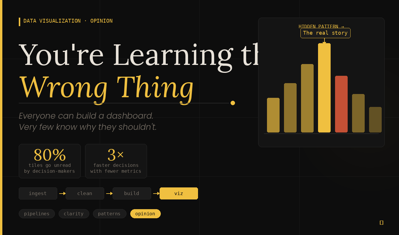
Everyone Can Build a Dashboard. Very Few Can Show You What's Actually Hiding in It.
Here's what I've come to think of as the real ceiling in data visualization work, and why most people never break through it.
The average dashboard shows you what happened. Revenue last month. Click-through rate this week. Ticket volume by category. It's a tidy summary of known things, and it's fine. Useful, even. But it's forgettable.
The exceptional dashboard makes someone lean forward in their chair.
It doesn't just show that revenue went up — it shows that revenue went up in three segments and quietly collapsed in a fourth one that nobody was watching. It doesn't just show that churn went down — it shows that the apparent drop is partly explained by a high-risk cohort that already churned last quarter and isn't in the denominator anymore. It surfaces the thing that would have stayed invisible for another six months if someone hadn't gone looking.
That's the difference. And it's not a design skill. It's an analytical habit.
Before I build anything, I spend time just living in the data. I run distributions. I look for anomalies. I slice by dimensions that weren't in the original brief. I ask "compared to what?" for every single number. I look for things that seem too clean, because real data is never that clean.
And then — only then — I figure out how to show what I found.
That's the sequence that produces work people remember. Not a better color palette. Not a fancier chart library. Smarter questions, asked before a single pixel is placed.
So Where Does That Leave Us?
I'm not saying don't learn the tools. Learn them — they matter, and fluency with them makes everything faster. But treat them as the last step, not the first.
The workflow that actually produces good data visualization looks something like this: understand the audience and the decision they're trying to make → explore the data deeply enough to find the real story → build a pipeline that keeps the data trustworthy and fresh → design the minimum number of visualizations needed to communicate that story clearly → check that every chart represents the data honestly.
That's it. Everything else is decoration.
The people whose dashboards actually get used aren't necessarily the best designers in the room. They're the ones who did the thinking before they opened Tableau.
Go be one of those people.