Automated loan application processing with machine learning
The business question
Manual loan processing is slow, inconsistent, and costly. Could a machine learning model match — or beat — human decision accuracy while processing applications in seconds?
What I did
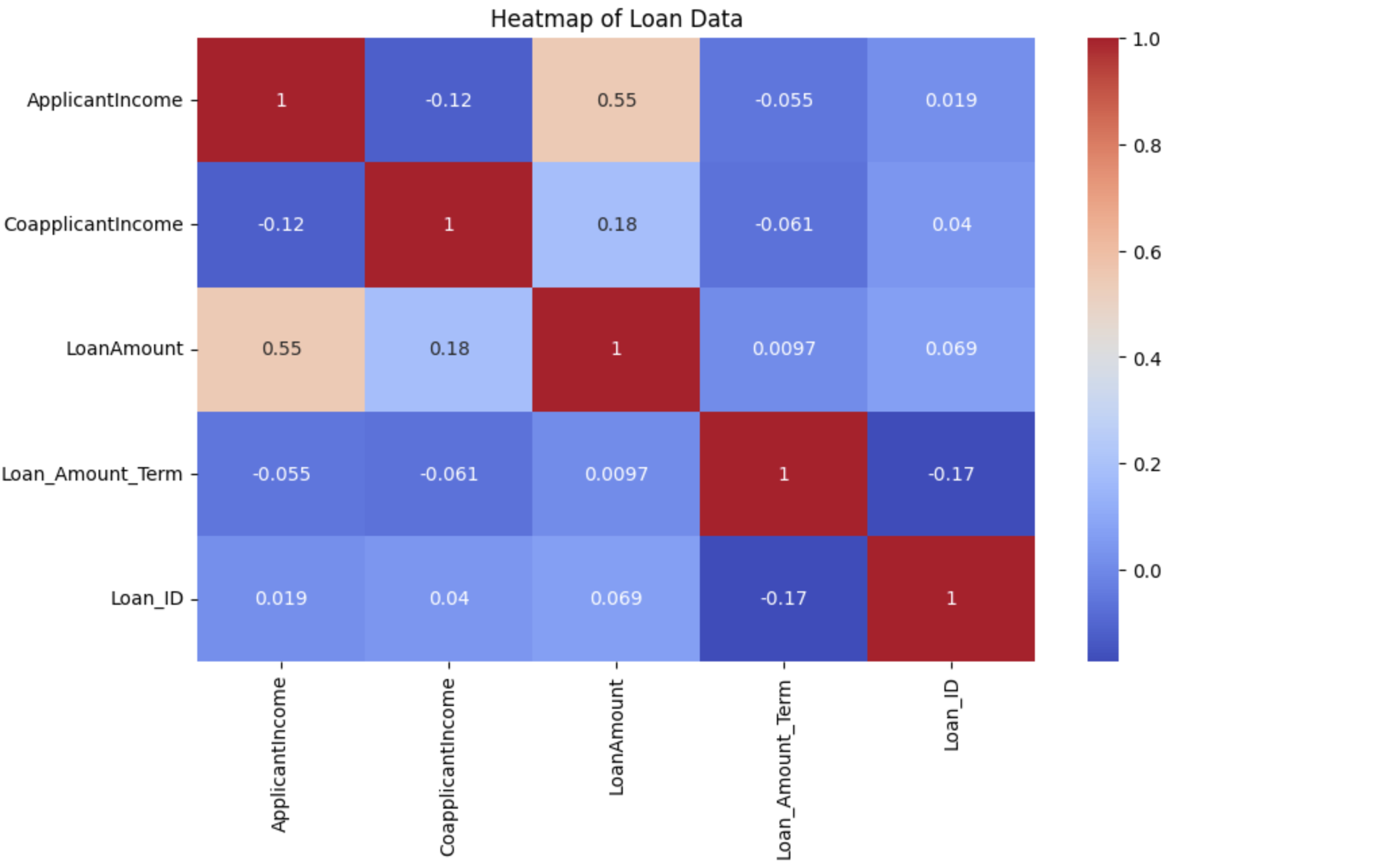
Built and compared multiple classification models (Logistic Regression, Random Forest, XGBoost) on historical loan data. Handled class imbalance using SMOTE, engineered features from applicant financial profiles, and evaluated models on precision, recall, and AUC-ROC. Identified the top predictive features driving approval decisions.
Key finding
The Random Forest model achieved 91% accuracy and 0.94 AUC-ROC, outperforming logistic regression by 7 percentage points. Debt-to-income ratio and credit history length were the two strongest predictors — accounting for 58% of model feature importance.